
In this tutorial, we are going to look at how to use Bootstrap to create your own responsive website.
What is a Responsive Website?
First off, what is a responsive site? Simply stated, a responsive website is one that adapts to the device used to view the site. The layout of the site changes so as to reduce the amount of resizing, panning, and scrolling needed, in order to provide an easy reading and navigation experience.
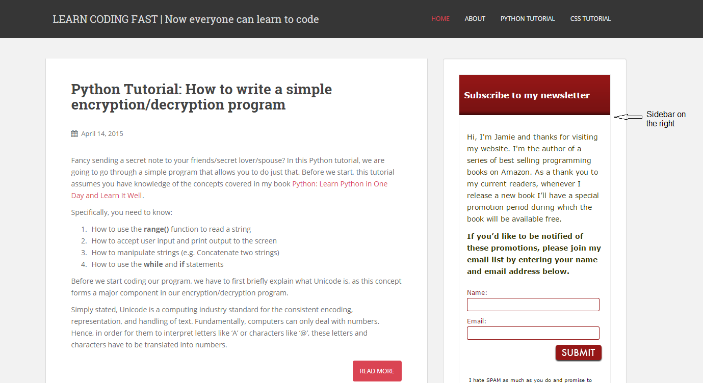
This site learncodingfast.com is an example of a responsive site.
If you view the site on a laptop, this is what you would see. The menu bar is on top with four menu items: HOME, ABOUT, PYTHON TUTORIAL and CSS TUTORIAL. The sidebar for my email subscription form is on the right.
However, if you view the site on your mobile phone, you will see a different layout. The top menu bar has collapsed into a single button with three horizontal lines. Clicking on the button will show you the layout below. If you scroll down, you’ll notice that the sidebar has also been pushed down.

As you can see, a responsive website makes for a more pleasant reading experience on a mobile device as it reduces the need to do any horizontal scrolling.
These days, it is important to make your website mobile-friendly as more and more people are surfing the net on their mobile phones. The good news is that it is pretty easy to code a responsive site. In the past, companies had to develop separate versions of their websites for desktop and mobile devices. This is no longer the case with the introduction of Bootstrap.
Bootstrap
So what is Bootstrap?
Bootstrap (also known as Twitter Bootstrap as it was developed by Twitter) is a hugely popular framework that you can use as a basis to create your own website. It contains pre-defined HTML and CSS components that you can use to build your own website. With Bootstrap, you do not need to code every single line of CSS and HTML yourself. All you have to do is know the names of the different classes in Bootstrap and include them in your own code. For instance, if you want to create a navigation bar that collapses into a single button when the screen size is reduced, you can use Bootstrap’s navbar-collapse class and data-toggle and data-target attributes by adding them to your HTML code.
In addition, you can also modify Bootstrap’s CSS rules if you want to make changes to the design.
Sounds abstract? Don’t worry. The two videos below by Coder’s Guide will give you an idea of how Bootstrap works. The first video gives you an introduction to Bootstrap and the second video shows how you can create a responsive navigation bar using Bootstrap.
It’s pretty cool…. Oh, and did I mention that Bootstrap is FREE? Yes, it is!!! You can download Bootstrap here.
You can download the source code in the video here. https://pastebin.com/raw.php?i=a515nrBg
Updates to Bootstrap 3
Note that the videos were created in 2013 and a recent update to Bootstrap 3 requires that you wrap the nav-brand and your responsive drop down button in a div with a class of navbar-header.
In other words, add the line <div class="navbar-header"> just before <a class="navbar-brand" href="#">Tech Site</a> and close the div by adding </div> just after </button>.
Javascript and jQuery
Another thing to point out is that Javascript and jQuery are needed for the responsive navigation bar to work. Do not worry if you don’t know Javascript or jQuery. You do not need to do any Javascript coding yourself.
The video mentioned importing jQuery from a CDN. CDN stands for Content Delivery Network and is kind of like an online library that stores source code and other Web content. The jQuery file that you need can be downloaded from this library. The other JS file needed can be found in the downloaded Bootstrap folder.
Here are the two lines in the HTML code that are responsible for linking to the two JS files needed.
<script src = "https://ajax.googleapis.com/ajax/libs/jquery/1.10.2/jquery.min.js"></script>
 <script src = "js/bootstrap.js"></script>
Ok, that’s all for today’s tutorial. I hope you have found it useful.
Have fun ‘bootstrapping’!